Your website is your virtual storefront. It is available 24/7 helping connect you with new customers and get them excited about your product or service. To catch your audience’s attention and keep visitors engaged you’ll want to avoid the 15 website design mistakes featured in our article. A recent study shows your website has exactly 50 milliseconds (0.05 seconds) to make a first impression. It’s a lot of pressure, but the truth is, design matters.
How do you make it happen? Your website’s design is the gateway to everything. Google performed a study to find out what website users want to see. They found that viewers preferred low visual complexity and high prototypicality.
1. Not Understanding Your Audience
When you create a website specifically for your target audience, they will immediately be more inclined to stick around. The first step in this process is identifying your target demographics. Create several marketing personas. Give them a name, an age, a profession, hobbies, and a reason why they are seeking your site. These are the details you need to tailor your presentation to your target audience. Without them, your website will likely get lost in the crowd.
2. Not Having Core Info Above the Fold
The fold in your website is where the page stops – when visitors need to start scrolling down the page. A quick glance at the information displayed above the fold should yield who you are and what you are marketing. If visitors have to put a lot of effort into finding this information, they probably will hit the back button before you’ve even had a chance to show off your offerings. Be sure you check both the mobile and desktop versions of your site for the best user experience.

3. Having A Slow Website
Don’t discount the power of speed when it comes to your website’s design. Fifty-three percent of people will leave your website if it does not load in three seconds or less. In the digital age, no one wants to wait for your stunning design to load. Keep it simple with web-ready images and easy code. While you might know your design is worth waiting for, no one will come to your page to find out. With Google’s new speed update released to all users in June, if your website takes too long to load, it will also drop to the bottom of the search engine rankings, making it basically invisible.
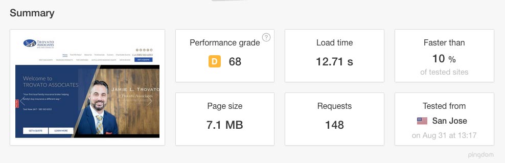
To determine how fast your page loads, there are some free tools you can use. Each one will give you data showing user experience and load times. Keep in mind the three-second rule when analyzing the numbers and be sure to use multiple tools to get a sense of how fast your site loads on different devices and on different browsers. Try these free tools and see where your website ranks for speed:
4. Not Having A Mobile-Friendly Website
According to a research study by Pew Media, one in five adults is now smartphone dependent. This means they have no other way of accessing the internet except their smartphone. When designing your website, be sure to optimize your site for a mobile device as well as a desktop – there’s a world of people you will be missing if you don’t. Responsive web design will adapt to the device your audience is using, avoiding the need to pinch and zoom.

To determine if your page is mobile-friendly, try this free tool from Google. It will rate your page’s mobile design and give you an idea of how your page is performing on a variety of mobile devices. By using this free tool, you can offer your audience a smooth visit to your site.
5. Having A Bad Navigation Experience
A research study about eye tracking by EyeQuant found the human eye is most attracted to the top left corner of a web page. The flow of information on your page should start from the top left corner and move from left to right and then top to bottom, like the letter F. Put the most important information in the top left corner, drawing in your audience at first glance.
Avoid large blocks of text and make use of bold headlines and bulleted lists for scannability. Remember, only about 20-28% of a website is actually read by visitors. Most scan the content to draw out what they need. Providing scannability in your content will allow readers to get what they need and view your site as a trusted source.
If you are not sure about the navigation experience on your website, there are some ways you can find out:
- Conduct a survey of your customers. Ask them what they like and what they don’t like. Be prepared to listen and make changes to the design, even if you don’t agree. If users have a more positive experience, it will translate to more sales.
- Try a user testing service. The company will send your website out to real users and ask for their feedback. This service usually comes at a price but can provide valuable information about how visitors navigate your site. Sometimes a small change makes a huge difference. Some of the top rated services include Crazy Egg, Loop11, and Mouseflow.
- A/B testing. Design two different versions of your website and see which one is more popular with users. You can conduct this survey on your own or use a service such as Optimizely, or VWO.
6. Not Having A Clear Call-To-Action
Have you ever arrived at a website, only to find you have no idea what to do next? A call-to-action (CTA) lets your audience know the next steps. Make a list of five things your target client would want to do on your website, such as shop for a product, contact you or learn more about your product. Buttons are a great tool to show where to click, making it obvious for the user.
A call-to-action can include language indicating an action such as:
- Sign Up
- Subscribe
- Shop Now
- Free Trial
- Get Started
- Join
- Launch
- Send Me Now
- Click here to find out.
- Discover
- Continue
- Waitlist

A call-to-action can also be a widget or gizmo on your site designed to make your audience take action. These can include:
- A countdown clock
- A portfolio of work
- Testimonials
- Stories
- A game
Think of a button you just couldn’t resist clicking and add it to your site. Get creative and have fun with it, making users remember your flair.
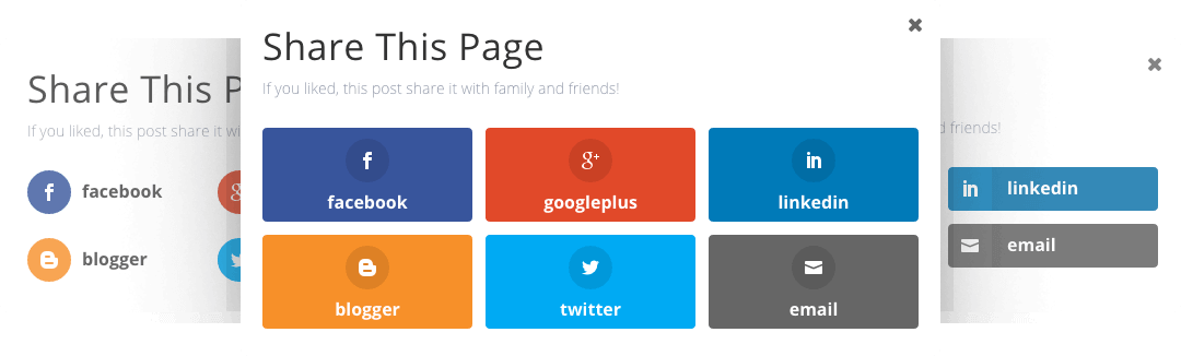
7. Not Utilizing Email Marketing and Social Media
You want people to arrive at your website, but you also want to give them an experience. Seventy-nine percent of people online use Facebook, and Gmail has a billion users worldwide. If you are not using other ways to connect with your customers, you are missing out on a huge opportunity. Offer them a chance to subscribe to your free email newsletter or to follow you on your social media channels. By connecting with them in a more personal way, you build a relationship and their trust.
One way to get people to sign up for your email list is by offering a freebie or incentive. Many websites offer a discount on the first purchase or a free e-book full of valuable tips for signing up for the newsletter. When your audience spots something of value, they want to have it and will click the link, connecting you on another level. It is important not to abuse this extra step and send them too many emails or posts on Facebook. Use your power wisely for marketing, brand recognition and connecting with your customers off your website.
8. Having Lots of Errors
Though your readers aren’t all English teachers, know that having too many typos or grammatical errors on your site decreases your credibility with both your audience and with Google. Seventy-five percent of people admit they judge a website’s credibility based on web design. Would you trust a textbook full of grammatical and spelling errors? Neither will your readers. If you are not grammatically-inclined, hire a proofreader or editor to view your site. They can catch any errors and help you improve your traffic.
9. Not Utilizing Whitespace
Don’t feel like you need to cram a ton of information all on one page. Whitespace, or just empty space on your page, is actually helpful in web design. A cluttered web page is hard to read and leaves your audience confused. By keeping whitespace in all the right areas, you draw the eye to your content and make the page look more elegant.
Think of a high-end retail boutique. Do they cram a million things on one shelf, or do they display their best product on a table by itself? Stunning websites keep it simple, letting the content and the images do the talking.
10. Inconsistent Branding
Your website should align with the design aspects of your company. Do you use a particular color in your logo? Incorporate it into your website. According to Lucidpress, “A brand exists in the mind of your customers.” When your customers see a specific design element, they should think of your brand. Take Target for example. Any time you see that round red circle with the dot in the middle, you immediately think of the retail store.
Brand recognition can feature:
- A specific color
- A logo
- A font
- An image
- A character
Any of these can make a user remember a specific brand. The more times someone thinks of your brand, the more they are going to remember to visit your website and connect.
11. Not Having Contact Information Easily Accessible
Can people figure out how to reach you? Your contact information needs to be available somewhere on the website, allowing your customers to reach out if they have questions. This is yet another way to build credibility with your potential customers. If a customer wants to purchase a product but can’t find the answer to their question, they will take their business elsewhere.
The least you should provide is a phone number and an email. You can also add a store location and a map for ease of access. Users are often trained to scroll to the footer of the page to locate contact information, so take the challenge and put your information in plain sight for everyone to see. If you are expecting a lot of phone calls, consider investing in a business-only phone line to keep things professional and on a work schedule.

12. Not Having A Search Feature
Offering customers a search feature gives them the option to quickly find what they are looking for on your site. Make the search bar at the top of the page or somewhere it is easily visible. Most people understand how to use a search so, in most cases, it doesn’t need a lot of explanation. Just having the option available will increase your user experience and your customers’ satisfaction.

It’s always good to do a quick test to make sure the feature is working before publishing. A faulty search bar is even more frustrating than a nonexistent search bar. WordPress websites have a search feature built in, but when designing your own site it can get complicated. Ask a professional for help if needed. It is worth the investment.
13. Having Outdated Information
Check your site to be sure you are offering your customers current and valid information. Remove anything past its expiration date, keeping your content relevant. Think of your website as an online resource. Update old contact information and remove anything sending an outdated message.
A good rule of thumb is to include evergreen pieces, or pieces that never expire in your content strategy. These pieces never fail to provide accurate information and will give your viewers something of value whenever they read it.
14. Invalid Links
Broken links are frustrating to users but, more than that, they make your business look unreliable. Typically, what happens when readers reach a broken link is they reach a 404-error page. This page typically displays a message stating they have reached the end of their journey. It happens when the site removes a page, moves it to a new location, or when the address is incorrect. Double check your link for accuracy and then either add new content or remove the link completely.
Instead of displaying a form response, design your 404-error page to point your readers in another direction. A link to the correct content works or a way to get back to where they were previously. Another option is to display a custom 404 page with your site logo and a fun message. Broken links happen to everyone but keep the humor in the situation and surprise them with something fun.
15. Being Too Extra
No one wants to be basic, but being too extra is just as serious a mistake. Keep your design elements simple, and don’t bombard users with overly contrasting colors or a pop-up “online chat” with an indecipherable X. One pop up to grab attention is fine but make it easy to close if they don’t want to use it.
Videos and music that automatically play when the website opens can overwhelm the senses. If you have video content on your website, let your audience decide when they want to hit the play button. Videos eat up cell phone data and, if your reader is traveling, they may immediately exit without even watching what you have to offer.
What Should You Do Next?
Armed with this knowledge, you can now create a website designed to serve your customer. Keep in mind your target audience and use the personas whenever you have a question about site usability. If you are struggling with web design, it is best to call in the professionals. Paying for professional web design has a huge return on investment for your business and will give you the peace of mind you need to focus on what you love.