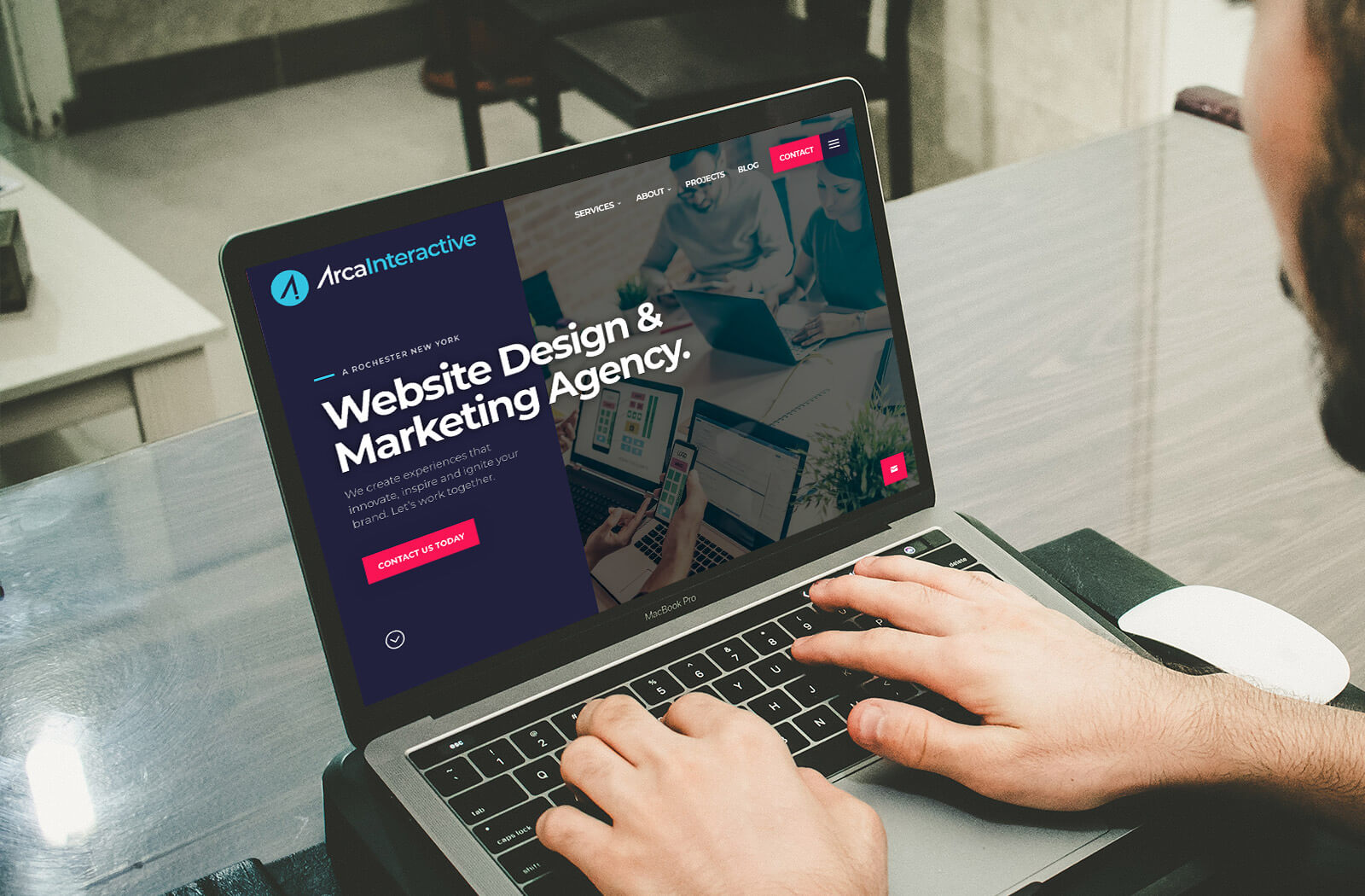
Though 2020 hasn’t provided the most stable world for real-life changes, the internet is thriving and changing faster than ever. For us, an exciting upshot of these changes is our updated website, launching this past week. With a completely new design, updated content, refreshed color scheme, and updated fonts, these tweaks are keeping our company on top when it comes to internet relevance. Here’s what we changed and why we changed it.
Fresh Content and a Reason to Visit
First and foremost, our goal here at Arca Interactive is to provide you, our clients, with the most up-to-date, innovative content in the industry. While we’ve always offered insightful content on our blog and key points of wisdom within all of our featured products and reviews, these have now been updated to better reflect the Arca Interactive you’ve come to rely on for all your web services. Best of all, you’ll have a reason to come back and visit us as we release updated information, agency insights, and industry news.
Revealing Web Copy
While our prior service descriptions, projects page, and other on-page content did a fair job of informing you about who we are and what we stand for, we knew we could do better. What you’ll see now are updated service descriptions that reflect our brand identity and company values as 2020 comes to a close. Perhaps even more importantly, you’ll be able to gain a clearer understanding of what each of our services consists of – right on our website.
Minimalist, Dynamic Web Design

Web design has trended more minimalist in the past few years, with consumers favoring sites that are aesthetically pleasing while being clean, organized, and simple. With that in mind, we’ve practiced what we preach and utilized a more modern, color-blocked design with colored page elements drawing the eye to our most important services. In addition, we’ve foregone the eye-catching page scroll features to focus on page content versus page design features.
Improved Access
Another important note we needed to hit was accessibility. Any brand owner can tell you that a homepage is the most frequently viewed landing page of them all. Providing seamless access to your brand’s best features directly from the landing page is crucial to success. We’ve added an organized view of our services, about info, testimonials and more – all on our homepage.
Fresher, More Streamlined Font

With all the easily accessible information and features we’ve added to our website, it was necessary to address our site font. We’ve chosen Montserrat, a sans-serif style very similar to our previous font to keep our branding elements consistent. The new font style is rather close in spirit to Gotham and Proxima Nova, but has its own individual appearance—more informal, less extended and more idiosyncratic leaving more space between words and letters. The result is text that is easier to read but still gives the modern vibe we were striving for throughout the page.
Brand Colors That Leverage Color Trends

For our update, we tweaked our colors to ensure they stayed on brand, with the latest trending colors informing our tweaks. However, color is such a huge part of our psychology as a human race, it doesn’t always make sense to change palettes altogether. We still wanted our clients to recognize us. As a compromise, we’ve both lightened and darkened hues based on our original color scheme to provide a more modern-feeling page that is still cohesive with our brand identity.
Brand New Logo
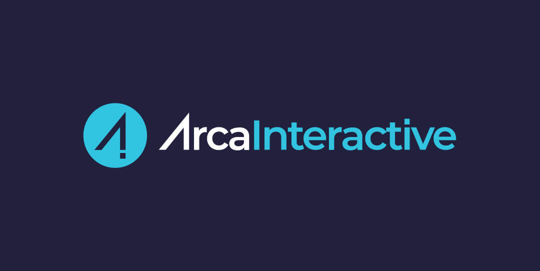
Color and design are doubly relevant when it comes to a company’s logo, and we worked hard to hit the nail on the head with a logo upgrade as well. With a newer, sleeker design, our new logo is easier to decipher – especially from a distance – but similar enough to our original that it doesn’t let our clients forget who we are.
Contact Arca Interactive to Update Your Website
We’re excited about rolling out this new website and logo update. When you’re ready to make changes to your site, boost traffic, and improve your brand’s reach, trust the team at Arca Interactive. Contact us for all your logo, web design, and brand relevance needs.
