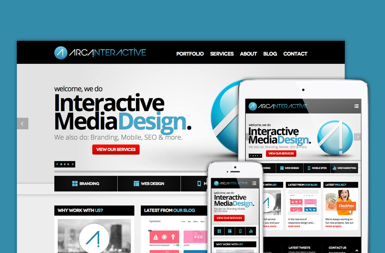
After months of planning, designing, writing and coding, we are proud to reveal the launch of our new website! The process of creating our newest asset began almost a full year ago and the final design you see today is the fourth version of the site. Early in the process we began developing a standard fixed pixel width website, when we realized that the new responsive design method would be a great creative upgrade. While in attendance of the 2012 HOW Interactive Design conference in Washington D.C., we first learned the inner workings of this revolutionary new design approach. After that conference it was back to the drawing board to begin designing an all new responsive website, but it was worth it!
We couldn’t wait to put this new mobile technique to work, but unlike most digital agencies, the needs of our clients come far before our own. The next few projects we worked on were designed to be responsive right from the beginning. This helped us to hone in on our new responsive design skills, while keeping our clients on the cutting edge of the most modern, innovative web design trends. Over the next several months, we carefully and meticulously designed every detail of our new site and are excited to finally launch it to the public.
The new website is completely responsive to any screen size and device. We didn’t just use size snapping points that you typically see with some of the templates available. Our new website smoothly and seamlessly transitions to the optimum viewing experience on any device. We also made several other content and functionality enhancements that we will discuss more about below:
Layer Slider
Our homepage incorporates one of the most exciting ways to showcase important content. The Layer slider is slideshow gallery that allows us to smoothly layer content and images at different speeds, directions and with effects. This tactic showcases the high level of interactive design that we offer our clients.
Retina Ready
Responsive design isn’t the only new kid on the block. As Apple continues to innovate and create cutting edge digital technology, we are all left at the mercy of their creations. With the release of the iPad3, iPhone5 and the new macBook Pro retina, we were met with a web design challenge that took some effort to match. If you own a Retina device you’ve probably noticed how some websites appear to be a bit fuzzy. This is due to that website not being optimized for the high resolution of retina devices. Their are several tricks to make sure your website is retina-ready and ensure your website media is crystal clear to the end user. We are proud to say that the new Arca Interactive website is 100% retina ready!
Streamlined Content
It is important to create website copy that is optimized to receive optimum search engine ranking, but we also know that not everyone will read all of our content. We worked to clean up our website and focus on the key points in our copy so that customers and future clients will benefit from the content that we provide.
Portfolio Case Studies
This particular section of our site took a great deal of time to showcase what we can really do at Arca Interactive. Our case studies provide information about the clients we worked with, the challenges we faced during the project, the visual of the final result and how we achieved success with the final solution. We think it’s important for you to understand our process and how we reach the final product.
A more engaging blog
We admit, a blog isn’t a unique feature to add to a website, but making it genuinely engaging is something that many websites don’t do. Our new blog has been designed with that very purpose in mind. We want our clients, designers and whomever may be interested to visit our blog and interact. We also promise to giveaway free design & development tips, online marketing advice and even free design files to our readers.
If you’ve made it this far into our blog then we thank you for taking the time to read about our new website. We hope that you enjoy it as much as we do and that it truly shows the innovative and cutting edge work we are doing at Arca Interactive. We strive to work hard and be different from other digital agencies, providing our clients with the best, most innovative final product. We welcome you to Arca Interactive’s fresh new website.


