We’re proud to announce that our website design for 5LINX was featured in Elegant Themes’ November 2018 Divi Design Showcase. Each month Elegant Themes chooses the top ten designs from its vast community of web designers and showcases them on their website. The 5LINX site, which combines large icons, image-oriented design, and well-crafted animation contrast, was chosen by the theme-building company for its unique and innovative use of Divi Design features.
About the 5LINX Site
The 5LINX site is designed for ease of reading and accessibility, using large text and multiple elements that divide website sections into headers. This allows users to find the information that they need quickly, without having to click on multiple links and visit multiple pages. The site opens with a large, simple header image and a well-defined menu bar along the top of the screen, allowing users to navigate to a certain page quickly.
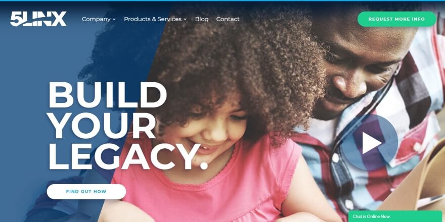
In addition, users can click the large play button on the right-hand side of the image to view a short, embedded promotional video about 5LINX. A large overlay and call-to-action are placed opposite the play button on the left-hand side, encouraging users to explore 5LINX’s product offerings.
5LINX’s products are showcased through large icons arranged in a multi-column design, using image-oriented design techniques to compel users to click on the icon and learn more. Hover animation adds dimension and movement to the product displays. Elegant Themes makes note that the 5LINX site uses dark shadow effects on many of its elements to stand out and add contrast to the rest of the site, including text, buttons, blog cards, and icons.

Elegant Themes notes that Arca Interactive also keeps a consistent design with 5LINX’s blog post section, highlighting each new post with a large icon and a compelling “Read More” link accompanied by a green arrow. When a user hovers over the icon, dark shadow animation appears, making the icon stand out. The arrow length also increases when the user hovers over it, adding more dimension and movement to the page.
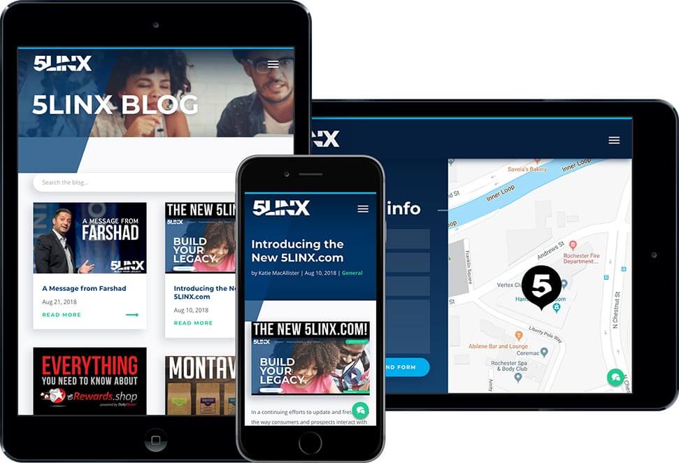
The 5LINX site follows a consistent design on its blog web pages, including the blog post display on the homepage, the landing blog page, and the posts themselves. Animation accompanies many of the other web pages throughout the 5LINX sites, moving as the user scrolls and explores the products the company has to offer. The 5LINX site is compatible across multiple screen sizes and resolutions, including desktop and mobile devices.
To learn more about Our innovative 5LINX design, visit the 5LINX case study portfolio here. To discuss ways to incorporate our work into your company’s website design, contact our Rochester web design experts to discuss your project and vision today.

