

Good Search Engine Optimization (SEO) has many facets – quality content, savvy digital marketing, and a responsive website. Responsivity is an important ranking factor for search engines and affects your business visibility. A site’s responsiveness refers to the readiness in which it loads and responds to different devices, including desktop, mobile, and tablets. Since nearly 50% of website traffic comes from mobile devices and an increasing number of individuals are making purchasing decisions on their phones, responsiveness should be an integral part of your SEO strategy. Learn the essential features of a responsive website and why you should integrate them to improve your business.
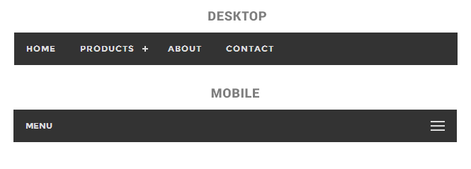
Navigation
One of the most important aspects of responsive web design is its ease of navigation. Site navigation should vary depending on the width of the browser. On a mobile website, navigation cues should be top and center for easy access, while desktops should feature navigation cues just under the logo. Columns are another important consideration for layout– information may be spread out over three columns or more on a desktop site, but should only have one column on a mobile site for ease of access. The Boston Globe is a good example of this and has recently been celebrated for its responsive design.
Fluidity and Flexibility
Remember that responsiveness, by definition, will change displays to be flexible depending on the device. Fluid changes in text and images between desktop and mobile will help ensure that a viewer has a seamless experience no matter what. For example, a mobile site might have increased font size and line heights in order to maximize legibility. Images are an important aspect of SEO, so making them flexible for mobile is well worth the extra effort.
At the same time, mobile browsers can have slower load times, and too many images can make the issue worse. Bounce rate is bad news for your website, so finding the right amount and quality of images for your site can be a delicate balance. As web design evolves, it’s essential to consider the selective use of quality images (say, professional unique photos) over quantity of stock images. A website redesign or revamp can be a good time to consider the quality and quantity of your images and other static website content.

Media Queries
While a bit technical, media queries are an essential aspect of responsive web design. A media queries is a CSS module that allows different content rendering depending on the device used, with particular regard to screen resolution. Media queries work in tandem with flexible page components and a solid CSS and HTML foundation to provide a seamless visitor experience, no matter the device.
Media queries allow web designers and developers to build multiple layouts for websites while using the same HTML documents. Certain aspects of the site will change based on the user’s browser size – for example, its orientation (portrait or landscape), the screen resolution, color saturation, and more.
Why You Need a Responsive Website
A truly responsive website provides the same high level of user experience across all other devices by preserving and adapting all necessary website content in order to maintain the experience across all possible platforms. In other words, a website user could start shopping online via desktop and pickup the experience on a mobile device later without interruption or content lags. In a competitive digital landscape, responsive sites are an integral aspect of your business success.
If your website does not respond seamlessly to different devices, you could be losing on valuable business, as potential customers find what they need from a competitor. Thankfully, a web design team can help ensure that your user experience translates across all devices and platforms. Contact Arca Interactive for help creating or revamping your responsive business website today.